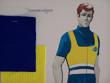
WALT DISNEY WORLD MONORAIL POSTER #2 1978
While WED was laboriously working on new attraction posters during the mid 1970's , Walt Disney World's opening day posters were wearing out and suffering from the extreme temperature and weather changes. At this time Disney wasn't using Stuart Burroughs Print service (the vendor that screened most of the attraction posters of the 1950's 1960's) anymore mainly due to costs. WED now had a one-of-a-kind serigraph silk screening equipment set up. WED was so busy working on new highly detailed posters for Jungle Cruise and Disneyland/Walt Disney World Railroad they did not have the time or money to replace ALL of the early WDW posters with elaborate silk screen re-dos. The solution: paint new attraction posters and lithograph them until we have time to do new tyvek-paper silk screen versions. This leads us to the great WDW poster replacements of 1978!!!! Some of these 1978 re-dos include HAUNTED MANSION, GRAND PRIX RACEWAY, CRYSTAL PALACE, IT'S A SMALL WORLD, AMERICA THE BEAUTIFUL, TROPICAL SERENADE, SWISS FAMILY ISLE TREEHOUSE, 20,000 LEAGUES UNDER THE SEA, and......................
WALT DISNEY WORLD MONORAIL SYSTEM 1978
off-set color lithography
here's the original 1971 opening day poster:
WALT DISNEY WORLD MONORAIL SYSTEM 1971
silk screened
And if you DISNEYLAND only attraction poster fans out there think this looks familiar:
Here's the Florida's ancestor next to the 1971 WDW counterpart. It's a mystery on the 1971 WDW posters as to why certain modification were made to showcase Florida only designs -----Like why does the 1971 Florida SKYWAY poster use the 1956 round Disneyland Skyway buckets?? These were already long out of use at Disneyland by 1971. And here on the WDW Monorail poster: why does the monorail exiting the Contemporary Resort Tower show a Disneyland Monorail while in the distance a correct White WDW Monorail heads towards the Magic Kingdom Monorail Station????? My speculation is both time and cost. Or were these just design flubs?
Subscribe to:
Post Comments (Atom)


Great post! Really like the comparison between posters. It's interesting to think back to an era when Disney did not have the time or money to do something as repetitively painless as updating ride posters. They've come a long way.
ReplyDeleteI'm sure you're right about the time and cost factors being the reasons that they used Disneyland's Monorail. These posters must be extremely rare, I've never seen any for sale!
ReplyDeleteA Snow White Sanctum : well you have to remember Walt Disney World at the time of it's construction was the largest single construction project ever done by man --that's a big thing and pretty expensive. It's possible there wasn't a very big budget for something like posters --also Disney didn't screen there own posters in 1971 a vendor did-it's also possible the vendor was already committed to other projects---but in general I do think it's odd that certain things were not changed on these posters. NOW, the 1978 versions were a different story. WED was revamping and creating all new poster art. The new versions were very very intricate and expensive to do. These took several months to create EACH poster and Walt Disney World needed to fill lots of now vacant attraction poster frames. So WED needed to create quick "stand-ins" .
ReplyDeleteMajor Pepperidge: Only 200 of each of the first Walt Disney World 1971 posters were created. Even WDI doesn't have many examples of these -- The 1978's have even fewer produced, --but I know a few people with them in there collection myself included.
Also on a side note I sometimes feature Tomorrowland ONLY related attraction posters that may not be featured here over on my other blog: TOMORROWLOUNGE.BLOGSPOT.COM -just in case you don't ger enough attraction poster stuff!!
ReplyDeleteI truly like to reading your post. Thank you so much for taking the time to share such a nice information.
ReplyDeleteZip Posters